The State of Social Media 2013 summarizes some of the major milestones and events in social media...
Via Ilkka Olander, massimo facchinetti
Get Started for FREE
Sign up with Facebook Sign up with X
I don't have a Facebook or a X account


 Your new post is loading...
 Your new post is loading...
Your new post is loading...
The State of Social Media 2013 summarizes some of the major milestones and events in social media... Via Ilkka Olander, massimo facchinetti 
No comment yet.
Sign up to comment

According to Wikipedia, infographics are “graphic visual representations of information, data or knowledge intended to present complex information quickly and clearly.” Simply put, it means taking data, organizing it, and making it visually digestible by converting it into graphs, charts, maps, and visual stories. Without having to read large amounts of text, the viewer can easily process the information that is being shared and is given the chance to explore a topic in a highly engaging way.
Visit the link to learn why and how infographics work, the benefits of infographics and the process behind creating them, including best practices and examples... Via Lauren Moss, Ivo Nový
![Social Media Wars Told in 'Game of Thrones' Style [INFOGRAPHIC] | Information Technology & Social Media News | Scoop.it](https://img.scoop.it/4nnFvfHQeM2s2AiQ_XM45Dl72eJkfbmt4t8yenImKBVvK0kTmF0xjctABnaLJIm9)
From
mashable

Brian Anthony Hernandez: "Social networks often put up their defenses against opposing social platforms. The social media wars are detailed in this Game of Thrones-themed infographic." Via The Digital Rocking Chair, massimo facchinetti

Claudio Gentile's curator insight,
June 3, 2013 4:59 AM
#socialmedia e #transmedia in una #infografica dedicata a #gameofthrones via @D_RockingChair

Like all new technology, social media changes fast. Just trying to keep your head around all of the different platforms, how to approach them and, of course, how to design for them can be a full time job. Social media has proven itself as a crucial component of a brand’s marketing mix, but with the many different platforms, it can be very difficult to put forth a consistent brand image online.
The [Ridiculously Exhausitive] Social Media Design Blueprint features all of the major design dimensions for all of the major platforms, including Facebook, Twitter, Google+, LinkedIN, YouTube, Pinterest and the most recent entry, Instagram. Via Lauren Moss, Jose Maria Hernandez Montes

Two Pens's curator insight,
May 30, 2013 1:31 PM
How to keep up with all those pesky design requirements on FB,LI, Twitter, etc. Thank you, somebody! 
MESODEV's curator insight,
May 31, 2013 4:01 AM
Voilà une infographie utile plutôt que de rechercher sans cesse les bonnes dimensions ! 
Therese Matthys's curator insight,
June 6, 2013 10:05 AM
Is your company consistent with its brand image online across all channels?
Infographics are interesting–a mash of (hopefully) easily-consumed visuals (so, symbols, shapes, and images) and added relevant character-based data (so, numbers, words, and brief sentences). The learning application for them is clear, with many academic standards–including the Common Core standards–requiring teachers to use a variety of media forms, charts, and other data for both information reading as well as general fluency... Via Baiba Svenca

maite collados's curator insight,
January 14, 2014 11:24 AM
Las infografías son una herramienta muy útil por su factor visual: en poco espacio y de forma visulamente agradable y atrayente, engloba datos y relaciona conceptos. 
ManufacturingStories's curator insight,
July 30, 2014 7:50 AM
For more resources on Social Media & Content Curation visit http://bit.ly/1640Tbl
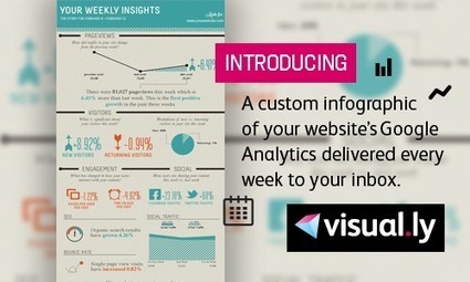
Have you ever tried to make quick sense of your website's Google Analytics report? Google Analytics is a great tool that provides a wealth of information about your website's traffic and engagement, but the dashboard style display of key metrics can be a little much to take in and meaningfully process. Yet more than 10 million people rely on this free tool to keep track of their daily web performance.
So the fine folks over at Visually created a Visually Google Analytics Report which can be automatically delivered to your inbox each week. The report transforms critical data about your website including the number of weekly page views, social engagement, SEO, and bounce rate into an easily accessible infographic. Via Jeff Domansky, Brian Yanish - MarketingHits.com

Brian Yanish - MarketingHits.com's curator insight,
March 30, 2013 6:52 PM
Love it, great to send to a client. 
Charles Lipshay's curator insight,
March 30, 2013 7:07 PM
Now a Blog with place for analytics & seo http://www.empowernetwork.com/almostasecret.php?id=lipshaybiz 
Daniel Polecheck's curator insight,
March 31, 2013 3:33 AM
This could be a good marketing tool to put the client on the fence over the fence.
![5 Reasons We Use Social Media [Infographic] | Information Technology & Social Media News | Scoop.it](https://img.scoop.it/0dX8Ctv2ZvgMgSGXFog8zzl72eJkfbmt4t8yenImKBVvK0kTmF0xjctABnaLJIm9)
There are many reasons we use social media. From the basic to the more advanced, the tool is simply ubiquitous and addictive. This infographic sheds some light for us all. Via Gust MEES, ThePinkSalmon

Latisha Poulard's curator insight,
March 21, 2013 10:46 PM
You see why if you don't have an online presence then you are part of a dying breed...
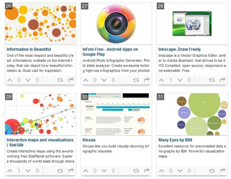
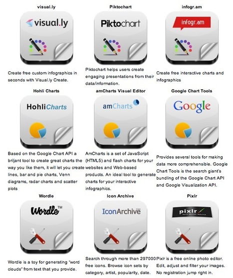
While not everyone can make infographics from scratch, there are tools available on the Web that will help you create your very own infographics. In this article, we’re listing more than 20 such options to help you get your messages across to your readers, visually.
What About Me? "What About Me?" is a personalization tool that produces colorful infographics that display your social media habits automatically from Facebook, Twitter and YouTube. The tool is provided by Intel. Create an infographic of your digital life and become inspired by the people you know, the things you see, and the experiences you have online.
Vizualize.me Vizualize.me allows you to create an online resume format that is beautiful, relevant and fun, all with just one click. It enables you to express your professional accomplishments in a simple yet compelling personal visualization, and will help optimize your LinkedIn Profile to get a kickass Visual Resume.
Piktochart With Piktochart, you get to create an innovative Infographic using a combination of different types of visualizations: themes, icons, vectors, images and chart exporter. Drag-and-drop and click your way through color schemes, shapes and fonts, then export the materials as static or html to easily embed it for use at your site.
easel.ly Easel.ly is a fun tool to create your Infographics with drag and drop features and a simple interface. You can easily create and share visual ideas online, supported by ‘vhemes’ or visual themes that help you get started from the preset Infograpic style. Drag and drop a ‘vheme’ onto your canvas to turn your idea into a full infographic.
Visual.ly (http://goo.gl/issJu) Visually helps you customize infographics in seconds, and no, you don’t have to be an analyst or designer to make infographics with Visually Create. Visual.ly allows you to also discover infographics and favorites from other users.
Infogr.am (http://goo.gl/UaK3G) Infogr.am is a simple yet most exciting way to create static and interactive infographics. Import raw data to Infogr.am, and the site’s online tool will help you turn that data into a nice looking chart or full-blown infographic in minutes.
Many Eyes (http://goo.gl/9SKr5) Many Eyes is an experiment by IBM Research and the IBM Cognos software group with a simple belief: ‘Finding the right way to view your data is as much an art as a science’. Many Eyes provides a range of visualizations from the ordinary to the experimental, where each can be put together with a click.
Venngage (http://goo.gl/GhLG7) Venngage is an online infographics tool that helps you create and publish custom infographics, and at the same time, engage viewers and track results. Venngage allows you to create beautiful infographics for blogs and websites and you can also watch the numbers of your audience grow with compelling and beautiful content.
iCharts (http://goo.gl/PXFFx) With iCharts, you can create great-looking charts in minutes with interactive and easy-to-share data. iCharts makes it easy to visualize, share and distribute big and small data.
Dipity (http://goo.gl/V4QLU) Dipity is a free digital timeline website, if you are looking for a different type of Infographics. The mission is to organize the web’s content by date and time. Dipity is the fastest and easiest way to bring history to life with stunning multimedia timelines.
Timeline JS (http://goo.gl/gCqpr) TimelineJS is a beautifully crafted timeline that is easy and intuitive to use. You can pull in media from different sources with built-in support for Twitter, Flickr, Google Maps, YouTube, Vimeo, Dailymotion, Wikipedia, SoundCloud and more.
StatSilk (http://goo.gl/Hk2DE) StatSilk offers web-based and desktop software to make data analysis easy, efficient and enjoyable, to cater to diverse mapping and visualisation needs.
InFoto Free (http://goo.gl/6uM6r) InFoto Free is an app for your Android to create an infographic of your photo-taking habits, using a Photo stats analyzer. With InFoto Free you can create awesome looking high-res infographics from your photo collection. It tells you things like what time of the day you prefer to take photos in, whether you prefer horizontal or vertical orientations as well as your favorite city to shoot in.
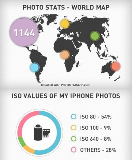
Photo Stats (http://goo.gl/b8mB1) Photo Stats is an iPhone app that analyses the photos you take on your iPhone. The app generates cool and stylish infographics that shows how, when and where you take your photos from. You get to easily visualize your photo-taking habits and share it with friends.
More Tools
ChartsBin (http://goo.gl/kSZ2k) – An online tool to create your own interactive map instantly with no installation or coding needed, and you can embed the map in your own website or blog easily too.
Tableau Public (http://goo.gl/EkmM0) – A free application for your Windows computer that brings data to life. You can create and share interactive charts and graphs, stunning maps, live dashboards and fun applications in minutes. Anyone can do it, it’s that easy.
Creately (http://goo.gl/D3gx8) – Want to create beautiful diagrams in no time? Creately may be a good choice to use as it can be used across all sectors by individuals, corporate teams, developers, software architects, students and teachers alike for diagramming purposes.
Gliffy (http://goo.gl/x3O6n) – Gliffy helps to easily create professional-quality flowcharts, diagrams, floor plans, technical drawings, and more. You can easily drag-and-drop your way through the makings of an infographic using the many shapes from an extensive library.
SIMILE Widgets (http://goo.gl/TvzqR) – SIMILE is a free and open-source data visualization Web widget.
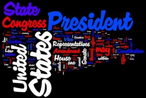
Tagxedo (http://goo.gl/2l0Uf) – Tagxedo turns words – famous speeches, news articles, slogans, themes, even your love letters – into a visually stunning word cloud. Every word is individually sized to highlight the frequencies of occurrence within the body of text.
Wordle (http://goo.gl/XS56D) – Wordle is a simple web app for generating “word clouds” from the text you provide. While the clouds give greater prominence to words that appear more frequently in the source text, you can also tweak your clouds with different fonts, layouts, and color schemes. Via 173 Sud, Chrisange , Rose Marie DeSousa, massimo facchinetti, Becky Gaylord, John van den Brink, juandoming

's comment December 31, 2012 4:00 AM
GR8 Collection! TYVM John!

Alfredo Corell's curator insight,
January 8, 2013 6:47 PM
While not everyone can make infographics from scratch, there are tools available on the Web that will help you create your very own infographics. In this article, they-re listing more than 20 such options to help you get your messages across to your readers, visually.
Some of them really simple. Most of them... visual. Try, gooo 
Devrim Ozdemir, Ph. D.'s curator insight,
January 9, 2013 8:39 AM
While not everyone can make infographics from scratch, there are tools available on the Web that will help you create your very own infographics. In this article, they-re listing more than 20 such options to help you get your messages across to your readers, visually.
Some of them really simple. Most of them... visual. Try, gooo
Maybe you want create your own infographic, here 10 tools to support you to do it. [note mg]
Information graphics, visual representations of data known as infographics, keep the web going these days. Web users, with their diminishing attention spans, are inexorably drawn to these shiny, brightly coloured messages with small, relevant, clearly-displayed nuggets of information. They’re straight to the point, usually factually interesting and often give you a wake-up call as to what those statistics really mean.
Who can resist a colourful, thoughtful venn diagram anyway? In terms of blogging success, infographics are far more likely to be shared than your average blog post. This means more eyeballs on your important information, more people rallying for your cause, more backlinks and more visits to your blog. In short, a quality infographic done well could be what your blog needs right now.
Read more: http://bit.ly/K0s4LL Via Martin Gysler
|
Robin Good: Here is a handy short guide to nine free infographic creation tools that can be utilized to create enticing visuals, word charts and data-based infographics without having special technical skills.
Useful. 8/10
Check them all out: http://www.infographicsarchive.com/create-infographics-and-data-visualization/ ;
(Unearted by Andres Taborga) Via Robin Good, NikolaosKourakos, Jim Lerman

Sahana Chattopadhyay's curator insight,
May 4, 2015 11:59 PM
Infographics are great tools to present curated and focused content from a specific perspective.
From
infogr
Create infographics and interactive online charts. It's free and super-easy! Follow other users and discover amazing data stories! Via Baiba Svenca

Victor GraphicSave's comment,
August 3, 2013 9:08 AM
Nice Post Visit My Logo Designs http://graphicsave.com/logo-designs
http://graphicsave.com/restaurant-logo
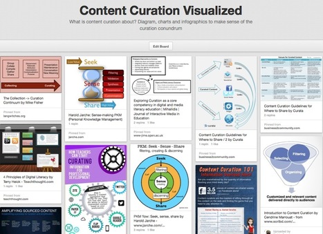
What is content curation about? Diagram, charts and infographics to make sense of the curation conundrum Via Robin Good

Monica S Mcfeeters's curator insight,
March 30, 2014 9:18 AM
This will be helpful to share to those wondering about content curation. 
Jeff Domansky's curator insight,
September 1, 2014 11:53 PM
Valuable collection of the art of curation from Robin Good.
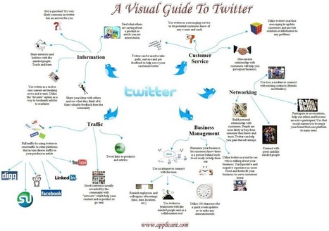
This infographic provides a visual guide and a brief synopsis of different uses for Twitter. It includes information about how Twitter can be used as a tool for information, customer service, networking, business management and website management. Via Lauren Moss, Lynnette Van Dyke, Terheck, John van den Brink

Gust MEES's curator insight,
April 22, 2013 8:58 AM
Gust MEES's curator insight,
April 22, 2013 9:01 AM

's comment August 8, 2013 10:34 PM
The curation comment is interesting... I think it's fantastic that students are able to gain these skills without the assistance of a teacher, but ultimately if they veer off the path or have been misguided, they will always need a facilitator to not only show students the tools but also give them some best practice ideas.

Viljenka Savli (http://www2.arnes.si/~sopvsavl/)'s curator insight,
August 13, 2013 2:13 AM
A new approach to learning and teaching concerns students' selflearning and assessing and of course techer's coaching. More about main principals in this article... 
Mary Kate Lavin's curator insight,
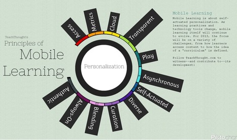
February 6, 2014 2:39 PM
This describes the 12 principles of mobile learning. It describes not only how to use technology in classes but also the reasoning behind using it.

AlGonzalezinfo's curator insight,
March 10, 2013 9:05 AM
G+ is catching up big time for many reasons. Among these reasons is the Hangout integration.
We just facilitated a remote 1.5 day leadership development session with Hangouts and it was fantastic.
Google is sticking to their strategy and their value is starting to win people over. I was never a fan and, through valuable features, I am changing my perspective on the suite of offerings.
This is a relevant infographic.
![10 Amazing #SocialMedia Statistics [INFOGRAPHIC] | Information Technology & Social Media News | Scoop.it](https://img.scoop.it/w7o92dIBdem4QnASs1Hy2Dl72eJkfbmt4t8yenImKBVvK0kTmF0xjctABnaLJIm9)
Did you know that Twitter is grabbing more new registrations than Facebook, with more than half of its entire userbase compromised of people who have signed up in the last year, compared to just 19 percent for Mark Zuckerberg’s baby? What if I said that almost a quarter (23 percent) of Facebook users check their account five or more times each day, Twitter users are 33 percent more likely to be Democrats or – sorry Foursquare – that 74 percent of Americans are unfamiliar with the concept of ‘checking in’.
These, and several other amazing social media statistics, can be found in the infographic on social media statistics... Via Lauren Moss, John van den Brink, Gladys Pintado
Robin Good: Here is a handy short guide to nine free infographic creation tools that can be utilized to create enticing visuals, word charts and data-based infographics without having special technical skills.
Useful. 8/10
Check them all out: http://www.infographicsarchive.com/create-infographics-and-data-visualization/ ;
(Unearted by Andres Taborga)
Hey All -- sometimes in business we need to display/convey data with our storytelling. So how do you display data in engaging ways? I love this article because it shares 6 free tools to use, plus there's a little tutorial on how to make infographics.
We all know how important it is to have the right tool for the job at hand. Bookmark this article so when you need the tools you have them. Enjoy playing with your numbers and showing them in different ways!
Thank you Robin Good for curating this article. Via Robin Good, J Lynn Lock
Sahana Chattopadhyay's curator insight,
May 4, 2015 11:59 PM
Infographics are great tools to present curated and focused content from a specific perspective. |


![Increase of Web Attacks 2010-2012 | mLearning - BYOD [Infographic] | Information Technology & Social Media News | Scoop.it](https://www.symantec.com/content/en/us/enterprise/images/security_response/SYMC-ISTR-webattack-page12.jpg)
![20 Reasons Why you Should Use Google Plus [Infographic] | Information Technology & Social Media News | Scoop.it](https://img.scoop.it/j1fJ08aqSCOFcw0g2J6fxjl72eJkfbmt4t8yenImKBVvK0kTmF0xjctABnaLJIm9)