


Via Robin Good
Get Started for FREE
Sign up with Facebook Sign up with X
I don't have a Facebook or a X account


 Your new post is loading...
 Your new post is loading...
Your new post is loading...


Susan Daniels's comment May 14, 2013 11:32 PM
Absolutely! Scoop.it is one of the best tools I've encountered in over ten years online :)

Robin Martin's comment,
May 15, 2013 10:28 AM
Absolutely agree!
Robin Martin's comment,
May 15, 2013 10:28 AM
Absolutely agree!
Sign up to comment
|
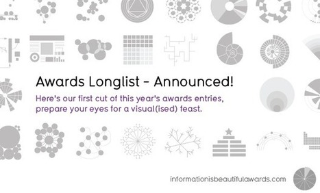
Robin Good: David McCandlees, the author of the book Information is Beautiful celebrates great data visualization and information design work through the Information is Beautiful Awards. » Data visualization– A singular visualisation of data or information.» Infographic – Using multiple data visualisations in service to a theme or story » Interactive visualization – Any viz where you can dynamically filter or explore the data. » Data journalism – A combination of text and visualizations in a journalistic format. » Motion infographic – Moving and animated visualizations along a theme or story. » Tool or website – Online tools & apps to aid datavizzing. The selection itself is worth a tour of the site and of this initiative. Check: http://www.informationisbeautifulawards.com/ Longlist selection: http://www.informationisbeautifulawards.com/2012/07/our-longlist/ Shortlist selection: http://www.informationisbeautifulawards.com/2012/08/awardshortlist/ Via Robin Good
|


I've been using Harold's model "Seek, Sense, Share" to explain the process of content curation to nonprofits. He first published it back in 2011 and I actually made my New Year's resolution for professional learning (http://www.bethkanter.org/seek-sense-share/)
In 2011, I had noticed that I needed to pay more attention to training my attention and to be more intentional about how I was sharing information. The Seek-Sense-Share framework really helped me. When I discovered content curation, I realized that I was doing it, but from reading Robin Good's work - I wasn't doing well.
I connected Harold's framework to content curation -- http://www.bethkanter.org/content-curation-101/ because like everything else I learn, I am turning around and using it in training - so I thought it was perfect.
Harold has updated his model and fine-tuned it for content curation.
Robin Good found it put into context - and related to the need for some sort of human intervention - to pick, select, and contextualize content - not just aggregate. I always appreciate Robin's great reminders about the need to be "brains on" when comes to curation.
Curation is not clicking, not cut and paste, not mindless sharing. You have to be disicplined about being intentional - and focus.