


Research and publish the best content.
Get Started for FREE
Sign up with Facebook Sign up with X
I don't have a Facebook or a X account
Already have an account: Login

Visualization Techniques and Practice
16.3K views |
+0 today
How to use visualization techniques for nonprofits in areas like data analysis, learning, facilitation, and innovation
Curated by
Beth Kanter
 Your new post is loading...
 Your new post is loading...
Your new post is loading...
Want to spice up your next corporate presentation? Take it from us, Make your next presentation Out Of This World! Download this Presentation for a Tweet here: Via Baiba Svenca 

Chantal Sim's curator insight,
May 20, 2013 1:18 PM
As I always trying to make my presentation more remarkable than before, I think it is good tips for me and us. These are really nice to learn for your future presentation especially for those of who have presentation for this semester.
So if you are interested in making your presentation look fancy and effective, it will be worthy to see all the slides!
Chantal Sim's comment,
May 20, 2013 1:20 PM
These are so valuable! Thank you for sharing this, appreciate so much that I can re-scoop.it!
2012 might be the year which we reached 'peak infographic'. You can’t have an issue or a piece of data without putting it into a picture so it’s easier for people to understand. While this has mostly resulted in a glut of ugly graphics that don’t actually do anything with data (and you’ll see some of these below), it’s still an incredibly simple way to get information to you fast. And this year, some of our most compelling content has appeared in the format. These are some of our favorites. Via Lauren Moss

Lauren Moss's curator insight,
December 21, 2012 5:40 PM
A curated infographic gallery from FastCompany...

As the old saying goes about pictures being "worth a thousand words," so goes the story about infographics. Infographics are a compelling way to represent complex information quickly and clearly. In an infographic, visual symbols and numbers are used with colors, fonts, and labels to make the data more useful. With the flood of information and exponential data points, it is imperative to focus people's attention on not just the valuable data, but the implications as well. Storytelling is using a linear narrative to guide people- as the creative and performance marketing communities work together to make sense of data, we must not squander the opportunity that this format provides. We need to create meaningful infographics that minimize information anxiety by conveying the perspective in the most effective manner. Agencies are tasked with providing creative expressions that connect target audiences with meaningful content -- and infographics are by no means any different. Visit the complete article to learn more about the fundamental factors that contribute to successful infographics:.. Via Lauren Moss

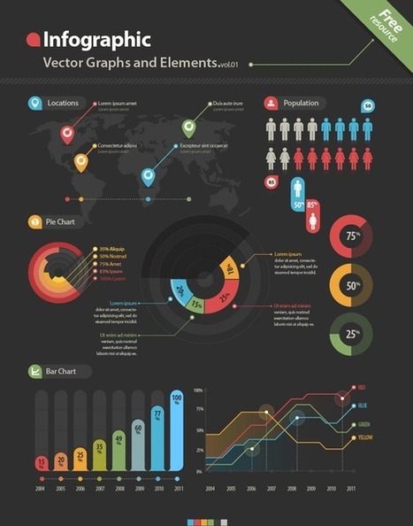
A free resource from Tripwire Magazine: a useful portfolio infographics design kit you can use for your personal or business portfolio or CV. For those looking for a simple and easy to tweak portfolio, take a look at this Infographics design kit- a tool for anyone updating a portfolio or CV to make it stand out. The elements come in PDS and Ai files... Via Lauren Moss

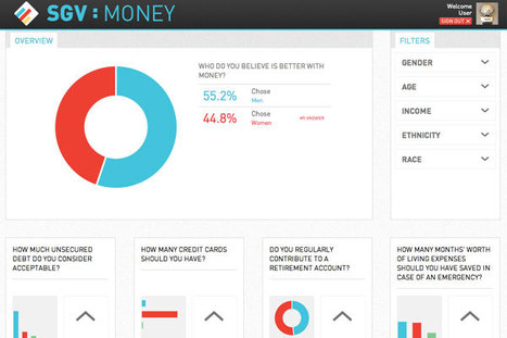
Generally, people don’t have the time or energy to sit and plow through pages or screens of text; they want to be able to ingest information as quickly and easily as possible. With the recent rise of infographics (information graphics), what used to require an avalanche of stats or analyses to dissect, can now be interpreted and relayed into an easy-to-read, fun, and visually appealing schematic – and an excellent content marketing concept. Infographics, when designed well, can be applied to different online sites and social networks. Summarized at the article are 5 free tools (with links) that allow you to start creating simple infographics or explore the potential of data visualization... Via Lauren Moss

Cb Bowman's curator insight,
September 10, 2013 12:33 PM
The Tools Needed To Get You Started in Using Infographics |
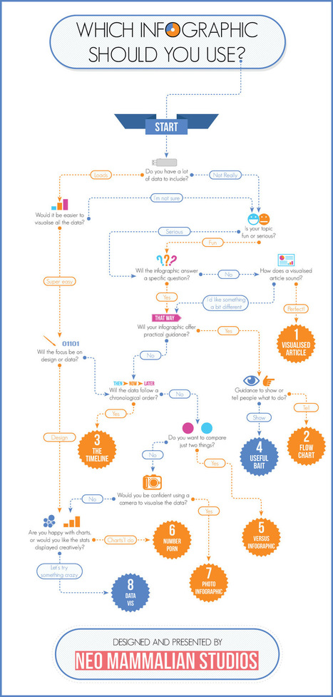
That’s right, there’s more to infographics than a scrolling image full of facts and figures. Different types of infographics are consumed differently. The right kind of infographic should match your data to your narrative and ensure that people take away your message after reading it. While infographics may not come in that many shapes or sizes (600 x 1,800 pixels is the norm), that doesn’t mean there’s a stock standard infographic for you. Use the flowchart to help you decide which infographic is right for you... Via Lauren Moss
Data Visualization is driven by data. Its form is often derived from optimizing the efficiency of inputting data (and information about that data) into a human brain. It is a very pragmatic practice, built around numbers and logic. And yet it is beautiful. It evokes emotions. It can be aesthetically pleasing, or hideous. It communicates complex concepts and provokes thought. It is consumed for enjoyment. Some visualizations even share similarities with poetry. There are several stages in the life cycle of data visualizations, and while the core of the practice is driven by rational thinking, any number of stages in the process have opportunities for subjective decisions or artistic interpretations... Via Lauren Moss
Lauren Moss's curator insight,
January 24, 2013 7:42 PM
An overview of the creative and artistic processes involved in data visualization...
A collection of resoureces and links to free infographic design vector elements, including various graphics, charts, labels, pictograms, symbols, maps and more- for use in designing infographics and data visualizations. Simply open the files in a vector based program and edit... Via Lauren Moss
The idea of a Socially Generative Visualization originated out of a section of the design handbook INFOGRAPHICS. Via Lauren Moss
Want to create an attractive infographic but don’t have the budget to hire a professional designer? Then you should try using an infographic-creation tool. If your small business is looking for an eye-catching and easy to comprehend way to teach, inform, and inspire others about its products and services, infographics might be a good solution. Infographics can be more effective and memorable than other ways to present data, making them particularly effective for online audiences. To create an infographic, you should make a list of possible ideas that you want to get across, create the initial draft or skeleton, color scheme it, and research your content from authoritative sites. Then it’s time to select your design platform. Read about three online tools that can help you create stunning infographics... Via Lauren Moss
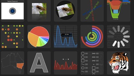
From simple charts to complex maps and infographics, Brian Suda's round-up of the best – and mostly free – tools has everything you need to bring your data to life... A common question is how to get started with data visualisations. Beyond following blogs, you need to practice – and to practice, you need to understand the tools available. In this article, get introduced to 20 different tools for creating visualisations: from simple charts to complex graphs, maps and infographics. Almost everything here is available for free, and \you may have installed already... Via Lauren Moss

Randy Rebman's curator insight,
January 28, 2013 12:33 PM
This looks like it might be a good source for integrating infographics into the classroom. |


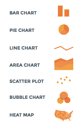
Really useful guide to selecting and designing charts and graphs to visualize your data.