 Your new post is loading...
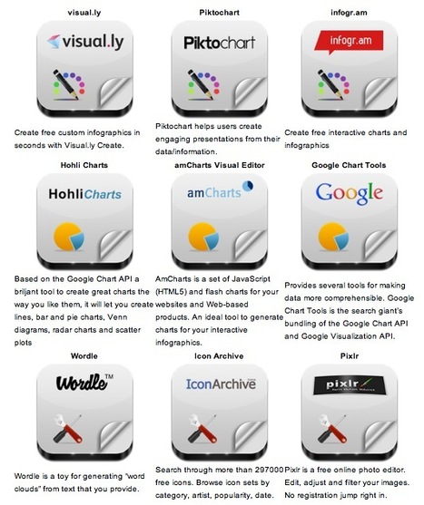
Robin Good: Here is a handy short guide to nine free infographic creation tools that can be utilized to create enticing visuals, word charts and data-based infographics without having special technical skills. Useful. 8/10 Check them all out: http://www.infographicsarchive.com/create-infographics-and-data-visualization/ (Unearted by Andres Taborga) Hey All -- sometimes in business we need to display/convey data with our storytelling. So how do you display data in engaging ways? I love this article because it shares 6 free tools to use, plus there's a little tutorial on how to make infographics.
We all know how important it is to have the right tool for the job at hand. Bookmark this article so when you need the tools you have them. Enjoy playing with your numbers and showing them in different ways!
Thank you Robin Good for curating this article.
Via Robin Good, Beth Kanter
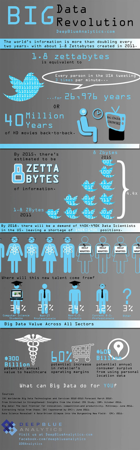
Is Big Data still a big mystery to you?
In recent years, the volume of information coming into companies has exploded, so that many IT organizations are dealing with extremely large sets of data.
IT leaders are rethinking many aspects of how they manage and deliver information, from investments in infrastructure and analytics tools to new policies for organizing and accessing data so they can deliver more of it, faster. They are concerned that if they don't have the right tools and architectures to deal with all that information, then big data can be a big problem. Check out these infographics on Big Data to see the impact...
Via Lauren Moss
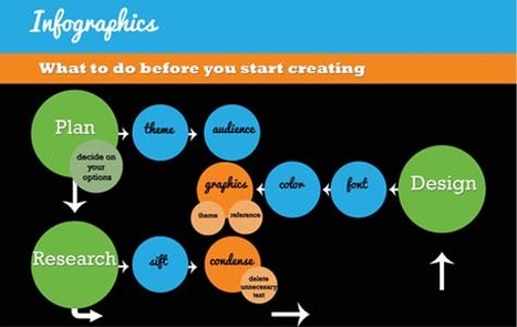
The last in a series of infographics about visual data design, we have covered why it's useful to create them, created an embed code generator for you and written an article on promoting infographics. We felt a fitting end to the series would be - you guessed it - an infographic.
This infographic (about infographics of course) goes through 4 stages of creating an infographic: research, design, publishing and promotion offering tips at each stage. If you are thinking about making your own infographics this not only provides some great tips but acts as a good example of an infographic itself...
Via Lauren Moss
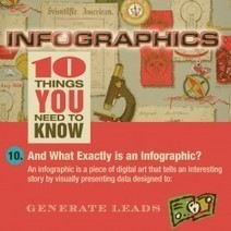
Kevin Akers design + imagery has just designed an infographic about infographics.
The list of top ten things everyone should know about the new marketing phenomenon clarifies how to create interesting,noteworthy infographics...
Via Lauren Moss
A free resource from Tripwire Magazine: a useful portfolio infographics design kit you can use for your personal or business portfolio or CV.
For those looking for a simple and easy to tweak portfolio, take a look at this Infographics design kit- a tool for anyone updating a portfolio or CV to make it stand out. The elements come in PDS and Ai files...
Via Lauren Moss
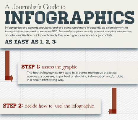
Let’s be honest, we don’t like to read big pieces of text. Text-heavy graphs are rather difficult for understanding, especially when dealing with numbers and statistics. That is why illustrations and flowcharts are often used for such kind of information. An infographic, or a visual representation of study or data, like anything else, can be done right or wrong. How to create a successful infographic? A good idea and a good design.
Stop by the link for more on what defines an infographic, what contributes to its popularity, as well as the various types of infographics and references for tutorials and best practices.
Additional topics covered include: - The major parts of an infographic
- How to create an infographic
- Developing ideas & organizing data
- Research & sources
- Typography, graphics & color
- Facts & conclusions
- Designing & Editing
Via Lauren Moss
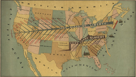
We live in a world steeped in graphic information. From Google Maps and GIS to the proliferation of infographics and animated maps, visual data surrounds us. While we may think of infographics as a relatively recent development to make sense of the immense amount of data available on the Web, they actually are rooted in the 19th century. Two major developments led to a breakthrough in infographics: advances in lithography and chromolithography, which made it possible to experiment with different types of visual representations, and the availability of vast amounts of data, including from the American Census as well as natural scientists, who faced heaps of information about the natural world, such as daily readings of wind, rainfall, and temperature spanning decades. But such data was really only useful to the extent that it could be rendered in visual form. And this is why innovation in cartography and graphic visualization mattered so greatly...
Via Lauren Moss
This piece was posted by Loren Sorenson for Hubspot, I selected it because as she says "If you aren’t prepared for the visual content revolution, you may be left in the dust.
Not convinced? Let's take a look at exactly how visual contentis positively contributing to marketing strategies -- it may just give you the push you need
"Learn why visual content is a critical part of your content creation strategy.
Here are some highlights:
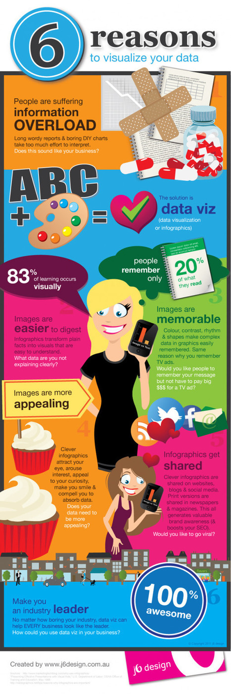
**People remember only 20% of what they read
**83% of learning is visual
Condenses and Explains Large Amounts of Information
**Today, there is too much information on the Internet you have about 3 seconds to catch someone’s eyes so they'll consume your information.
Gives Your Brand an Identity
**Visual content draws people in, letting viewers better understand your brand's identity
Drives User Engagement
**If you've ever read a book with a child, you probably know they find pictures more interesting than words; but are adults really that different?
Selected by Jan Gordon covering "Content Curation, Social Business and Beyond"
Read full article here: [http://bit.ly/Ifujbp]
Via janlgordon
Images make everything better!
Well, not everything, just most things.
Currently, we are watching the rise of visual social media. Images are getting more traction than words on Instagram, Pinterest, YouTube and Facebook.
Via Frank J. Kenny

|
Scooped by
Beth Kanter
|
Infographics (or Information Graphics) are graphic visual representations of data or information, presented in a way to make it easier to consume information. Infographics gained popularity ...
Curated by Beth Kanter http://www.bethkanter.org
There are a lot of tools that can help you create an infographic, but if you want to work for your nonprofit you need some design skills. But a good infographic is not just about being a pretty picture, it requires research and making sure that it is conveying the right message. Designing infographics is a hybrid design skill - falling somewhere inbetween print, web, and data visualization skills.
This post summarizes the design process:
1. Define concept and goals 2. Use reliable resources 3. Data should have a flow or tell a story
The article is written for designers so the 4th principle is get client feedback. For nonprofits, it means getting some feedback from people who are your intended audience - almost like beta testing a web site.
Has your nonprofit hired a designer to create an infographic or create a DYI version? What are your tips and best practices.
Via Lauren Moss
Visual Skills to the ticket out of being overwhelmed -------------- This piece was posted by Loren Sorenson for Hubspot, I selected it because as she says "If you aren’t prepared for the visual content revolution, you may be left in the dust. Not convinced? Let's take a look at exactly how visual contentis positively contributing to marketing strategies -- it may just give you the push you need "Learn why visual content is a critical part of your content creation strategy. Here are some highlights: **People remember only 20% of what they read **83% of learning is visual Condenses and Explains Large Amounts of Information **Today, there is too much information on the Internet you have about 3 seconds to catch someone’s eyes so they'll consume your information. Gives Your Brand an Identity **Visual content draws people in, letting viewers better understand your brand's identity Drives User Engagement **If you've ever read a book with a child, you probably know they find pictures more interesting than words; but are adults really that different? Selected by Jan Gordon covering "Content Curation, Social Business and Beyond" Read full article here: [http://bit.ly/Ifujbp]
Via janlgordon
|
|
Scooped by
Beth Kanter
|
Infographics are visual representations of information, or “data viz” as the cool kids call it these days. Here's a great article on how to create infographics, or tell a story using 'data viz.' Translating data into a story is tough work and this article gives us some fabulous tips on how to do it. Not a graphic designer? Don't worry -- as a business person the more you know about how to create a great data viz story, the better you can tell a graphic designer or graphic scriber what you want. Another reason I like this article is because it actually mentions the need to create a storyline for your visual, and know before had what the key message is you are trying to deliver. The storytelling points the article leaves out are the storytelling devices of metaphor, analogy, contrast, and sensory material that are critical to a story's and an infographic's success. These pieces are implied in the article, but need more direct discussion about. Use this article as a great guide. And if you want more detail, go dig into "Visualize This" by Nathan Yau (although it can be pretty technical).
|
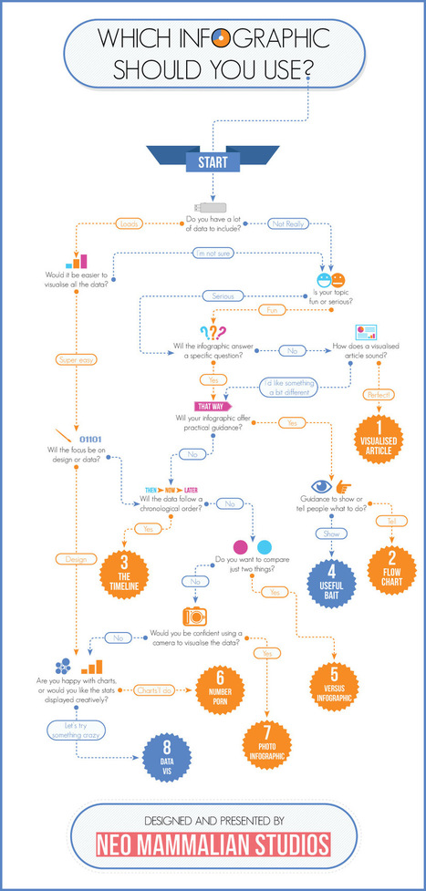
That’s right, there’s more to infographics than a scrolling image full of facts and figures. Different types of infographics are consumed differently. The right kind of infographic should match your data to your narrative and ensure that people take away your message after reading it. While infographics may not come in that many shapes or sizes (600 x 1,800 pixels is the norm), that doesn’t mean there’s a stock standard infographic for you. Use the flowchart to help you decide which infographic is right for you...
Via Lauren Moss
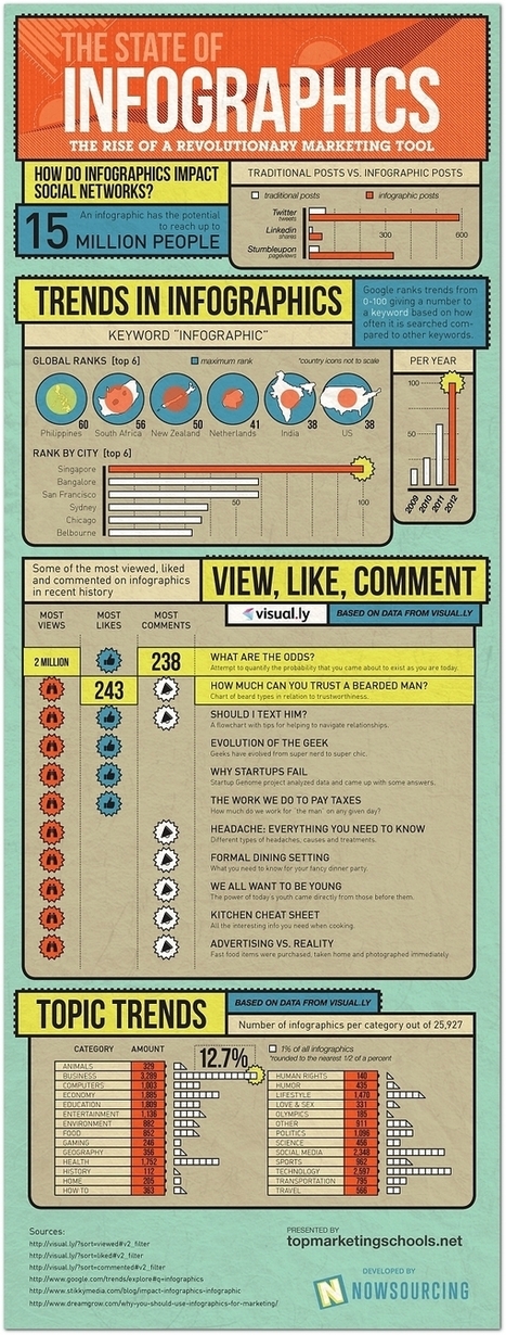
It turns out 2012 was a huge year for the infographic—internet culture likes its data presented with charming representative imagery.
Business, technology, and social media comprised the most popular topics for this exploding medium, according to data, Singapore searched the term “infographic” more than any other global city.
The year’s most popular infographic was “What Are the Odds,” which explores how improbable it is that you (or this infographic, for that matter) came into existence in the first place...
Via Lauren Moss
As the old saying goes about pictures being "worth a thousand words," so goes the story about infographics.
Infographics are a compelling way to represent complex information quickly and clearly. In an infographic, visual symbols and numbers are used with colors, fonts, and labels to make the data more useful. With the flood of information and exponential data points, it is imperative to focus people's attention on not just the valuable data, but the implications as well. Storytelling is using a linear narrative to guide people- as the creative and performance marketing communities work together to make sense of data, we must not squander the opportunity that this format provides. We need to create meaningful infographics that minimize information anxiety by conveying the perspective in the most effective manner. Agencies are tasked with providing creative expressions that connect target audiences with meaningful content -- and infographics are by no means any different. Visit the complete article to learn more about the fundamental factors that contribute to successful infographics:..
Via Lauren Moss
The human brain processes visual information much faster and digests this type of content concurrently, whereas it takes more time to break text down. So, for many, it makes more than just sense to have your complex information delivered to your target audience in the most legible format...
Infographics make good use of brain’s ability to assimilate knowledge and information through the visual medium, making tough-to-crack-data appealing. Simply put, an infographic is a carefully composed collage of images, content, charts, stats, diagrams, animations & video to graphically represent information. Infographics are used by various quarters such as educational institutions, acadamecians, businesses, newspapers, and just anybody who are serious about putting across their point in the most simplest manner. Infographics take different forms- venn diagrams, charts, timelines, maps and more. They are not merely a design or an image or random data; their purpose should be seen from every angle.
Visit the link to learn more about the process of creating infographics, how to implement online tools and resources, and best practices...
Via Lauren Moss
Want to create an attractive infographic but don’t have the budget to hire a professional designer? Then you should try using an infographic-creation tool. If your small business is looking for an eye-catching and easy to comprehend way to teach, inform, and inspire others about its products and services, infographics might be a good solution. Infographics can be more effective and memorable than other ways to present data, making them particularly effective for online audiences. To create an infographic, you should make a list of possible ideas that you want to get across, create the initial draft or skeleton, color scheme it, and research your content from authoritative sites. Then it’s time to select your design platform.
Read about three online tools that can help you create stunning infographics...
Via Lauren Moss
Generally, people don’t have the time or energy to sit and plow through pages or screens of text; they want to be able to ingest information as quickly and easily as possible. With the recent rise of infographics (information graphics), what used to require an avalanche of stats or analyses to dissect, can now be interpreted and relayed into an easy-to-read, fun, and visually appealing schematic – and an excellent content marketing concept. Infographics, when designed well, can be applied to different online sites and social networks. Summarized at the article are 5 free tools (with links) that allow you to start creating simple infographics or explore the potential of data visualization...
Via Lauren Moss
Beth Kanter http://www.bethkanter.org
Another way to articulate the importance of sense-making.
Think about it this way: Tools are not always actual objects designed to help us with physical activities. A notebook, whether it is a Moleskine or an Evernote digital document, is a tool that expands our memory. A digital calculator, whether it is an inexpensive machine bought in the nearest Dollar Tree or an app downloaded to your iPhone, frees you from the burden of having to retain and execute many complex mathematical algorithms. Non-physical tools (or sets of tools and practices), such as statistics and the scientific method, evolved to let us gaze beyond what we would normally see, and to overcome our deepest biases and lazy habits of mind. The same is true for great visual displays of information...
Via Lauren Moss
You’re a marketer. And half your job is marketing your ideas. Like it or not, you have to be good at proving your point, ‘cause being right isn’t enough. You have to justify the time, dollars and effort required for your internet marketing campaign. In the meeting room struggle for resources, your best weapon is great data presentation. Events tell a story. and people more easily follow a story told visually than one told verbally. Want to get better? Avoid these six gigantic visualization mistakes...
Via Lauren Moss
Curated by Beth Kanter http://www.bethkanter.org
Want to create your own infographics? Here's 20 tools that help you. But tools alone won't do it -you need a credible data source, visualization and sense making skills, and some graphic design skills. Don't that scare you off .. but be ready to invest some thought before you dive into playing with the tools.
Via Ritu Sharma
|
|
Rescooped by
Beth Kanter
from SM
|
Maybe you want create your own infographic, here 10 tools to support you to do it. [note mg] Information graphics, visual representations of data known as infographics, keep the web going these days. Web users, with their diminishing attention spans, are inexorably drawn to these shiny, brightly coloured messages with small, relevant, clearly-displayed nuggets of information. They’re straight to the point, usually factually interesting and often give you a wake-up call as to what those statistics really mean. Who can resist a colourful, thoughtful venn diagram anyway? In terms of blogging success, infographics are far more likely to be shared than your average blog post. This means more eyeballs on your important information, more people rallying for your cause, more backlinks and more visits to your blog. In short, a quality infographic done well could be what your blog needs right now. Read more: http://bit.ly/K0s4LL
Via Martin Gysler, Khaled El Ahmad
|


![Why Images Actually Matter [Infographic] | Visualization Techniques and Practice | Scoop.it](https://img.scoop.it/vR0D6SJS41lk6S16xoMPwjl72eJkfbmt4t8yenImKBVvK0kTmF0xjctABnaLJIm9)


Good tools to make Infographics
Infographics voor zij die er nog steeds zot van zijn.
Infographics are great tools to present curated and focused content from a specific perspective.