
Flourish est un formidable outil de datavisualisation. Il est assez facile à prendre en main et il est gratuit. Que demander de plus.
Via Fidel NAVAMUEL
Get Started for FREE
Sign up with Facebook Sign up with X
I don't have a Facebook or a X account


 Your new post is loading...
 Your new post is loading...
Your new post is loading...
Flourish est un formidable outil de datavisualisation. Il est assez facile à prendre en main et il est gratuit. Que demander de plus. Via Fidel NAVAMUEL 
No comment yet.
Sign up to comment

Timetoast est un excellent outil pour créer une timeline ou une frise chronologique, seul ou en groupe simplement.

Paristique est une impressionnante carte en ligne qui permet de découvrir d’un clic l’origine de la plupart des rues et lieux de la capitale française.

Stephen Dale's curator insight,
February 10, 2015 11:55 AM
Another excellent personal information management tool, HT to Robin Good for spotting.
If you've ever struggled with what visualization to create to best show the data you have, The Data Visualization Catalogue might provide just the help you Via Robin Good

Robin Good's curator insight,
February 2, 2014 5:47 AM
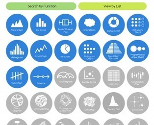
The Data Visualisation Catalogue is an on-going project developed by Severino Ribecca which attempts to index and catalogue all of the data visualization approaches available, in order to help journalists, designers and professional communicators identify more easily the type of data visualization most appropriate for their needs. . In the Catalogue there are now over 50 different data visualization approaches that have been identified, and about a third of them have also been documented with a basic description, visual examples, relevant tags to associate it with their possibe best uses, variations, and with a list of alternative tools available to create that type of data chart. . You can browse the catalogue also by using the "Search by Function" which is designed to aid in choosing the appropiate data visualization approach based on the specific communication need at hand, or with the "View by List" approach, which organizes dataviz methods by types. . My comment: Excellent resource for visual communicators of all kinds as it helps you see the great variety of dataviz approaches available. It makes it easier to identify and select relevant solutions according to needs and use. . Check it out: http://blog.visual.ly/the-data-visualization-catalogue/ . . Hat Tip to @LelioSimi 
Una Sinnott's curator insight,
February 2, 2014 4:54 PM
A great collection of data visualisation tools, categorised by the characteristics of the data you want to show. 
Juliana Elisa Raffaghelli's curator insight,
February 19, 2014 7:14 AM
Rappresentare: raccontare la realtà in modo tale da attrarre in modo efficace l'attenzione del nostro interlocutore/lettore. In una società iperconnessa e dialogica, fondamentale competenza. |

Charttt est un tout nouvel outil en ligne qui simplifie grandement la création et le partage de diagrammes ou de graphiques. Via Fidel NAVAMUEL
On connaît la chanson « Une image vaut mille mots » De ce point de vue, les outils TICE en ligne apparus ces derniers mois permettant de créer des infographies y participent grandement. Difficile de départager le meilleur outil actuel. Voici dix d’entre eux.
Robin Good's curator insight,
May 8, 2015 5:03 AM
Silk is a web tool to publish online spreadsheet-based data on a specific topic. The service, which just released a new version of its offering, allows to easily convert any existing data-set into professional-looking data displays, charts, grids, and lists that can be embedded on any site and which can be viewed in multiple ways. The value of Silk is specifically in making it easy and immediate for anyone to elegantly display and publish data sets in one of several alternative formats which include:
How it works: Import a table from Excel, Google Sheets or any .csv file, select the fields you want to import and Silk does the rest offering you tools to filter, edit and select your preferred visualization approach. You can also create data sets and displays from scratch inside Silk, and set each Silk either as public or private. Why it is relevant for content curators: Silk provides a unique and powerful opportunity to leverage existing data and information assets, spreadsheets and databases and to convert them into highly legible and visually impactful data displays on a very specific topic. My evaluation: Paired with the power of Kimonolabs or Import.io to convert any website or page content into a spreadsheet, it offers great potential in creating value by providing multiple professional formats to display, present and interact with such data. Free forever for public Silks of up to 3000 pages. Try it out now: https://www.silk.co/ Video tutorials: https://www.silk.co/product 
Grouptech21's curator insight,
March 10, 2016 3:54 PM
Silk is a web tool to publish online spreadsheet-based data on a specific topic. The service, which just released a new version of its offering, allows to easily convert any existing data-set into professional-looking data displays, charts, grids, and lists that can be embedded on any site and which can be viewed in multiple ways. The value of Silk is specifically in making it easy and immediate for anyone to elegantly display and publish data sets in one of several alternative formats which include: Table ListGrid MosaicGroupsBarsMapDonutLinePieScatterStacksHow it works: Import a table from Excel, Google Sheets or any .csv file, select the fields you want to import and Silk does the rest offering you tools to filter, edit and select your preferred visualization approach. You can also create data sets and displays from scratch inside Silk, and set each Silk either as public or private. Why it is relevant for content curators: Silk provides a unique and powerful opportunity to leverage existing data and information assets, spreadsheets and databases and to convert them into highly legible and visually impactful data displays on a very specific topic. My evaluation: Paired with the power of Kimonolabs or Import.io to convert any website or page content into a spreadsheet, it offers great potential in creating value by providing multiple professional formats to display, present and interact with such data. Free forever for public Silks of up to 3000 pages. Try it out now: https://www.silk.co/ ; Video tutorials: https://www.silk.co/product ;

luiy's curator insight,
September 2, 2014 5:01 PM
The Open Data Barometer takes a multidimensional look at the current adoption level of open data policy and practice around the world. Three main categories are considered as part of the barometer:
- Readiness - identifies how far a country has in place the political, social and economic foundations for realising the potential benefits of open data. The Barometer covers the readiness of government, entrepreneurs and business, and citizen and civil society.
- Implementation - identifies the extent to which government has published a range of key datasets to support innovation, accountability and more improved social policy. The barometer covers 14 datasets split across three clusters to capture datasets commonly used for: securing government accountability; improving social policy; and enabling innovation and economic activity.
- Emerging impacts - identifies the extent to which open data has been seen to lead to positive political, social and environment, and economic change. The Barometer looks for political impacts – including transparency & accountability, and improved government efficiency and effectiveness; economic impacts – through supporting start-up entrepreneurs and existing businesses; and social impacts – including environmental impacts, and contributing to greater inclusion for marginalised groups in society.
These factors have been combined onto a Radar chart, this represents the countries barometer. |