
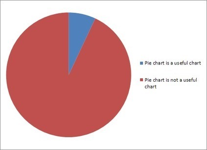

In case Business Insider's attack against pie charts had too many words for you.
Get Started for FREE
Sign up with Facebook Sign up with X
I don't have a Facebook or a X account


 Your new post is loading...
 Your new post is loading...
Your new post is loading...
In case Business Insider's attack against pie charts had too many words for you. 
No comment yet.
Sign up to comment

Reviews of the worst infographics on the internet. Know of a terrible infographic? Why not submit it for review?
Beth Kanter's insight:
You can learn a lot from looking at bad examples as well as good ones.

Suzi Shapiro's curator insight,
June 14, 2013 10:03 PM
Bad information and bad visuals make for confusion
There are still open questions, but the research can provide some answers about what works.
Beth Kanter's insight:
Visualization is easy, right? After all, it's just some colorful shapes and a few text labels. But things are more complex than they seem, largely due to the the ways we see and digest charts, graphs, and other data-driven images. While scientifically-backed studies do exist, there are actually many things we don't know about how and why visualization works. To help you make better decisions when visualizing your data, here's a brief tour of the research.

Stephen Dale's curator insight,
May 9, 2013 12:07 PM
Proving that data visualisation is more of a science than an art.
Beth Kanter's insight:
This is a comprehensive, but well curated list of resources for data storytelling. Worth a deep dive or two
Beth Kanter's insight:
The deck from Gregor Aisch's workshop on data visualization. This 176 slide powerpoint deck goes through why and how to select particular types of charts. Practical advice on color and use of maps too. Chart advice particularly useful:
Beth Kanter's insight:
I've been using Harold's model "Seek, Sense, Share" to explain the process of content curation to nonprofits. He first published it back in 2011 and I actually made my New Year's resolution for professional learning (http://www.bethkanter.org/seek-sense-share/) In 2011, I had noticed that I needed to pay more attention to training my attention and to be more intentional about how I was sharing information. The Seek-Sense-Share framework really helped me. When I discovered content curation, I realized that I was doing it, but from reading Robin Good's work - I wasn't doing well. I connected Harold's framework to content curation -- http://www.bethkanter.org/content-curation-101/ because like everything else I learn, I am turning around and using it in training - so I thought it was perfect. Harold has updated his model and fine-tuned it for content curation. Robin Good found it put into context - and related to the need for some sort of human intervention - to pick, select, and contextualize content - not just aggregate. I always appreciate Robin's great reminders about the need to be "brains on" when comes to curation. Curation is not clicking, not cut and paste, not mindless sharing. You have to be disicplined about being intentional - and focus.

's comment May 14, 2013 11:32 PM
Absolutely! Scoop.it is one of the best tools I've encountered in over ten years online :)
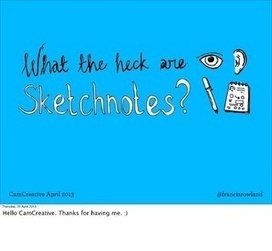
Slides that accompanied a talk I gave for the CamCreative meetup group (Cambridge, UK).
Infographics are visual representations of information, or “data viz” as the cool kids call it these days.
Here's a great article on how to create infographics, or tell a story using 'data viz.'
Translating data into a story is tough work and this article gives us some fabulous tips on how to do it.
Not a graphic designer? Don't worry -- as a business person the more you know about how to create a great data viz story, the better you can tell a graphic designer or graphic scriber what you want.
Another reason I like this article is because it actually mentions the need to create a storyline for your visual, and know before had what the key message is you are trying to deliver.
The storytelling points the article leaves out are the storytelling devices of metaphor, analogy, contrast, and sensory material that are critical to a story's and an infographic's success. These pieces are implied in the article, but need more direct discussion about.
Use this article as a great guide. And if you want more detail, go dig into "Visualize This" by Nathan Yau (although it can be pretty technical).

I was recently in Kiev, for Tactical Studios, running a training on Social Media for the Eurasian Harm Reduction Network, GIZ and Deutsche AIDS-Hilfe. To be fair, not everyone in the training was a...
|

|
Rescooped by Beth Kanter from Digital Presentations in Education |
Want to spice up your next corporate presentation? Take it from us, Make your next presentation Out Of This World! Download this Presentation for a Tweet here:

As I always trying to make my presentation more remarkable than before, I think it is good tips for me and us. These are really nice to learn for your future presentation especially for those of who have presentation for this semester.
So if you are interested in making your presentation look fancy and effective, it will be worthy to see all the slides!
|
|
Rescooped by Beth Kanter from Internet Marketing Strategy 2.0 |


November's focus for Soical Biz is IMAGES (following the focus on Pinterest in October). There are some really helpful free tools available to help any entrepreneur, image-challenged or not, make an impact at image hungry social sites e.g. Pinterest, Facebook and Google+. There's no doubt images draw attention and drive visibility and traffic.

Free tools which will help you create your own images with quotes.
|
|
Scooped by Beth Kanter |

With these services, you don’t have to be a designer to create a high-quality, effective infographic.
|
|
Scooped by Beth Kanter |
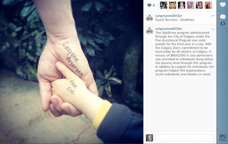
When preparing its 2012 Annual Report, The Calgary Zoo traded its traditional PDF for Instagram. See how their images encouraged engagement and learn what brands can take away from this creative approach.

Very innovative use of Instagram by a nonprofit!

|
|
Scooped by Beth Kanter |

Learn how to use charts and graphs to communicate your message clearly and effectively.
What chart should I use?
|
|
Scooped by Beth Kanter |
PRESENTER: Alberto Cairo (@albertocairo), Instructor, University of Miami. DESCRIPTION: Too many journalists still relate the word "design" to making pages an
From a presentation at data journalism conference by Alberto Cairo
http://journalisminteractive.com/2013/live-blog-the-functional-art-design-and-infographics/

|
|
Scooped by Beth Kanter |
Schedule and exercises for my Spring 2013 Infographics class at the University of Miami
This is the syllabus for Alberto Cairo's infographics class at the University of Miami. It is a combination of graphic design skills, information design, and information journalism. There is an excellent, curated list of resources in the syllabus:
|
|
Scooped by Beth Kanter |
Marketing Maven. Connector. ideacamper. Blogger. Trafficking-Hater. God-Lover. Wife & Mom. Nerd. Goof. Dawn is using Pinterest, an online pinboard to collect and share what inspires you.
|
|
Scooped by Beth Kanter |
Presentation created for ASTRA {American Specialty Toy Retailer Association} to discuss integrating visual content into social media strategy.
Some good photo/smart phone tips. It also talks about how to visually brand your social channels ...
|
|
Scooped by Beth Kanter |
Data Visualization For Beginners Instructor: @lisawilliams Hashtag: #D4R h...
|
|
Rescooped by Beth Kanter from Pinterest & Instagram for Nonprofits |

Among Pinterest's 48 million users, here are 10 that have found innovative ways to use the social platform.
|
|
Rescooped by Beth Kanter from visual data |
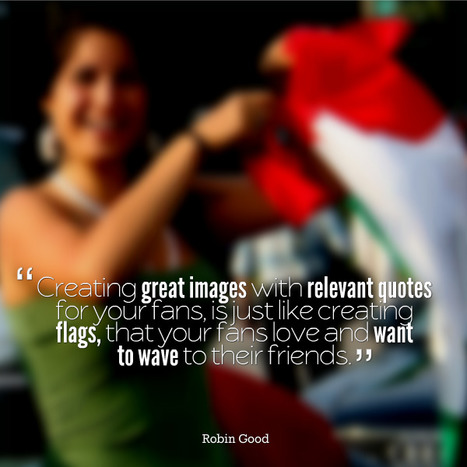
That’s right, there’s more to infographics than a scrolling image full of facts and figures. Different types of infographics are consumed differently.
The right kind of infographic should match your data to your narrative and ensure that people take away your message after reading it.
While infographics may not come in that many shapes or sizes (600 x 1,800 pixels is the norm), that doesn’t mean there’s a stock standard infographic for you.
Use the flowchart to help you decide which infographic is right for you...
|
|
Scooped by Beth Kanter |
I take notes using my iPad -- in a very visual way. Using images as well as text, I draw the notes using my fingertip and a drawing application like Sketchbook

I'm wondering if the newer 128gb version might be the best choice in the ever increasing mobile world.


Don't use pie charts