Visualization Techniques and Practice
16.3K views | +0 today
Follow
Visualization Techniques and Practice
How to use visualization techniques for nonprofits in areas like data analysis, learning, facilitation, and innovation
Curated by Beth Kanter
Your new post is loading...
Rescooped by Beth Kanter from visual data
Scoop.it!

6 Deadly Sins of Data Visualization

6 Deadly Sins of Data Visualization | Visualization Techniques and Practice | Scoop.it
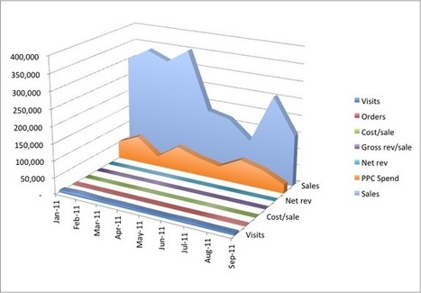
You’re a marketer. And half your job is marketing your ideas. Like it or not, you have to be good at proving your point, ‘cause being right isn’t enough. You have to justify the time, dollars and effort required for your internet marketing campaign. In the meeting room struggle for resources, your best weapon is great data presentation.

Events tell a story. and people more easily follow a story told visually than one told verbally.

Want to get better? Avoid these six gigantic visualization mistakes...


Via Lauren Moss
No comment yet.
Scooped by Beth Kanter
Scoop.it!

Visual Marketing Tips Tools Best Practices

Visual Marketing Tips Tools Best Practices | Visualization Techniques and Practice | Scoop.it

curated by Beth Kanter

http://www.bethkanter.org


This infographic illustrates the best practices for infographic - you could use this as a template.   The link takes you to the Ultimate Guide for Marketing with Infographics and includes practical tips and best practices.


The guide link is here: http://unbounce.com/content-marketing/ultimate-guide-to-marketing-with-infographics/#...

No comment yet.
Scooped by Beth Kanter
Scoop.it!

Visual Marketing Tips Tools Best Practices

Visual Marketing Tips Tools Best Practices | Visualization Techniques and Practice | Scoop.it

Curated by Beth Kanter

http://www.bethkanter.org


This infographic explains what an infographic is, the value of an infographic, and how to measure it.   It also includes some numbers.

No comment yet.
Rescooped by Beth Kanter from Content Curation World
Scoop.it!

A Curated Selection of Data Visualization Charts and Infographics: The Information Is Beautiful Awards

A Curated Selection of Data Visualization Charts and Infographics: The Information Is Beautiful Awards | Visualization Techniques and Practice | Scoop.it

Robin Good: David McCandlees, the author of the book Information is Beautiful celebrates great data visualization and information design work through the Information is Beautiful Awards.

Together with a jury of experts like Brian Eno, Paola Antonelli, Maria Popova, Simon Rogers and Aziz Kami, he has curated a unique selection of 300 designs and a short list of finalists in the following categories:


» Data visualization– A singular visualisation of data or information.» Infographic – Using multiple data visualisations in service to a theme or story


» Interactive visualization – Any viz where you can dynamically filter or explore the data.


» Data journalism – A combination of text and visualizations in a journalistic format.


» Motion infographic – Moving and animated visualizations along a theme or story.


» Tool or website – Online tools & apps to aid datavizzing.


The selection itself is worth a tour of the site and of this initiative.


Check: http://www.informationisbeautifulawards.com/


Longlist selection: http://www.informationisbeautifulawards.com/2012/07/our-longlist/


Shortlist selection: http://www.informationisbeautifulawards.com/2012/08/awardshortlist/


Via Robin Good
No comment yet.
Rescooped by Beth Kanter from visual data
Scoop.it!

How To Assess Quality of Infographic

How To Assess Quality of Infographic | Visualization Techniques and Practice | Scoop.it

Curatored by Beth Kanter

http://www.bethkanter.org


Is an infographic good or not?

(1)  Graphics - look/feel

(2)  Are there insights shared based on data?


Via Lauren Moss
No comment yet.
Rescooped by Beth Kanter from Measuring the Networked Nonprofit
Scoop.it!

6 Great Interactive Data Visualization Tools for Nonprofits

6 Great Interactive Data Visualization Tools for Nonprofits | Visualization Techniques and Practice | Scoop.it

Beth Kanter

http://www.bethkanter.org


In this 2-part series, I'm going to focus on the rapidly changing world of interactive tools for data visualization, or dataviz. These tools are especially useful for nonprofits and financial organizations whose brands rely on sharing metrics to deliver impact and value. Recently, many exciting HTML/CSS/Javascript-based data visualization tools have emerged. Some focus their attention on traditional charting and graphing, but others delve into the world of geocharting, heatmaps, timelines, and more.

No comment yet.
Rescooped by Beth Kanter from SM4NPGeneralSocialMedia
Scoop.it!

20+ Tools to Create Your Own Infographics

20+ Tools to Create Your Own Infographics | Visualization Techniques and Practice | Scoop.it

Curated by Beth Kanter

http://www.bethkanter.org


Want to create your own infographics?  Here's 20 tools that help you.  But tools alone won't do it -you need a credible data source, visualization and sense making skills, and some graphic design skills.     Don't that scare you off .. but be ready to invest some thought before you dive into playing with the tools.


Via Ritu Sharma
No comment yet.
Rescooped by Beth Kanter from visual data
Scoop.it!

So you wanna design your own infographic?

So you wanna design your own infographic? | Visualization Techniques and Practice | Scoop.it

Curated by Beth Kanter

http://www.bethkanter.org


There are a lot of tools that can help you create an infographic, but if you want to work for your nonprofit you need some design skills.    But a good infographic is not just about being a pretty picture, it requires research and making sure that it is conveying the right message.   Designing infographics is a hybrid design skill - falling somewhere inbetween print, web, and data visualization skills.


This post summarizes the design process:


1. Define concept and goals

2. Use reliable resources

3. Data should have a flow or tell a story


The article is written for designers so the 4th principle is get client feedback.   For nonprofits, it  means getting some feedback from people who are your intended audience - almost like beta testing a web site.


Has your nonprofit hired a designer to create an infographic or create a DYI version?   What are your tips and best practices.


Via Lauren Moss
No comment yet.
Scooped by Beth Kanter
Scoop.it!

NodeXL: Network Overview, Discovery and Exploration for Excel

NodeXL: Network Overview, Discovery and Exploration for Excel | Visualization Techniques and Practice | Scoop.it

Visualizing your network.   


This tool helps.  


NodeXL is an Excel 2007/2010 template for viewing network graphs, along with a set of .NET Framework 3.5 class libraries that can be used to add network graphs to custom applications.


My write up the workshop that I took back in 2009

http://beth.typepad.com/beths_blog/2009/12/can-social-network-analysis-help-you-improve-your-social-media-strategy.html

No comment yet.
Scooped by Beth Kanter
Scoop.it!

Challenge

Community visualization project.    One displays visualizations on a Facebook Page to facilitate engagement.

No comment yet.
Scooped by Beth Kanter
Scoop.it!

Tactical Tech's INFO-ACTIVISM CAMP 2013 | Tactical Technology Collective

Tactical Tech's INFO-ACTIVISM CAMP 2013 | Tactical Technology Collective | Visualization Techniques and Practice | Scoop.it

The Art of Using Data and Design for Evidence based Activism'
First Call for Tactical Tech's Info-Activism Camp 2013'

No comment yet.
Scooped by Beth Kanter
Scoop.it!

How to Create an Awesome Infographic

How to Create an Awesome Infographic | Visualization Techniques and Practice | Scoop.it

A terrific infographic about how to create infographics. 

No comment yet.
Scooped by Beth Kanter
Scoop.it!

Big Data Philanthropy for Humanitarian Response

Big Data Philanthropy for Humanitarian Response | Visualization Techniques and Practice | Scoop.it

Curated by Beth Kanter

http://www.bethkanter.org


Patrick Meier has a post about "Big Data Philanthropy for Human Response."     Defined as: Data philanthropy involves companies sharing proprietary datasets for social good. 


Another indicator of the growing and important trend of data visualization across many sectors.


Original article here:

http://irevolution.net/2012/06/04/big-data-philanthropy-for-humanitarian-response/#


No comment yet.
Scooped by Beth Kanter
Scoop.it!

Visual Marketing Tips Tools Best Practices

Visual Marketing Tips Tools Best Practices | Visualization Techniques and Practice | Scoop.it

Curated by Beth Kanter

http://www.bethkanter.org


This is a terrific list of 100 free tools for data visualization - it includes infographic tools - 

http://dailytekk.com/2012/02/27/over-100-incredible-infographic-tools-and-resources/...

No comment yet.
Scooped by Beth Kanter
Scoop.it!

Visual Marketing Tips Tools Best Practices

Visual Marketing Tips Tools Best Practices | Visualization Techniques and Practice | Scoop.it

Curated by Beth Kanter

http://www.bethkanter.org


This infographic is from 2009 - which probably explains it design simplicity.  It explains the value of using infographics.

No comment yet.
Scooped by Beth Kanter
Scoop.it!

Visual Marketing Tips Tools Best Practices

Visual Marketing Tips Tools Best Practices | Visualization Techniques and Practice | Scoop.it

Curated by Beth Kanter

http://www.bethkanter.org


This is a great visual of how to visualize and make sense of your data.   

No comment yet.
Rescooped by Beth Kanter from Chambers, Chamber Members, and Social Media
Scoop.it!

Why Images Actually Matter [Infographic]

Why Images Actually Matter [Infographic] | Visualization Techniques and Practice | Scoop.it
Images make everything better!
Well, not everything, just most things.
Currently, we are watching the rise of visual social media. Images are getting more traction than words on Instagram, Pinterest, YouTube and Facebook.

Via Frank J. Kenny
Beth Kanter's comment, September 2, 2012 12:04 PM
Terrific find!
Scooped by Beth Kanter
Scoop.it!

Tips, tricks and resources to make your own gorgeous infographics

Tips, tricks and resources to make your own gorgeous infographics | Visualization Techniques and Practice | Scoop.it
Infographics (or Information Graphics) are graphic visual representations of data or information, presented in a way to make it easier to consume information. Infographics gained popularity ...
No comment yet.
Scooped by Beth Kanter
Scoop.it!

The Rise Of Visual Social Media

Curated by Beth Kanter

http://www.bethkanter.org


Talks about the new emerging discipline of "visual marketing" given the plethora and popularity of visual social media platforms and infographics.

No comment yet.
Scooped by Beth Kanter
Scoop.it!

Get Inspired and Organized: Mind Mapping

Get Inspired and Organized: Mind Mapping | Visualization Techniques and Practice | Scoop.it

Curated by Beth Kanter

http://www.bethkanter.org


Mind maps, visual organizers, are terrific for organizing wild brainstorms for writing reports, preparing presentations, or as a prelude to your editorial calendar.     This article written for an audience of content marketers provides some examples of using mindmaps to brainstorm ideas for blog posts. 


I like mindmaps for data visualization too because it help you get to the higher level synthesis.


It also mentions two mind map apps:


http://www.mindmeister.com/

http://bubbl.us


Do you use mindmaps?  How? 


No comment yet.
Scooped by Beth Kanter
Scoop.it!

Responsive Information Design for Infographics with Dynamic Data

Responsive Information Design for Infographics with Dynamic Data | Visualization Techniques and Practice | Scoop.it

Curated by Beth Kanter

http://www.bethkanter.org


What is Responsive Design?


Responsive Design creates the optimal user experience for different use cases and enviroments, all built into one website. For example, an interface that automatically scales and re-arranges for a mobile device vs. a full-scale monitor, is using responsive design.

What is Responsive Information Design?


Responsive information design is very similar, but it involves being responsive to the incoming data as well. It defines a set of best practices for designing data visualizations and infographics where the nature of the data that is being visualized is not 100% known at the time of its design. In other words:


The aim of Responsive Information Design is to produce a
robust visual representation for information with varying
forms, shapes, and sizes.

No comment yet.
Scooped by Beth Kanter
Scoop.it!

Download White Paper - Civic Navigator White Paper

No comment yet.
Rescooped by Beth Kanter from SM
Scoop.it!

7 Photo Editing Apps to Use With Instagram

7 Photo Editing Apps to Use With Instagram | Visualization Techniques and Practice | Scoop.it
These tools will help make some necessary adjustments to your photos before you start adding effects to enhance them.

Via Khaled El Ahmad
No comment yet.
Rescooped by Beth Kanter from Nonprofit Leadership
Scoop.it!

The Data Journalism Handbook

The Data Journalism Handbook | Visualization Techniques and Practice | Scoop.it

Editors: Jonathan Gray, Liliana Bounegru, Lucy Chambers

Site: Data Journalism Handbook


Overview:  Handbook on using data for journalism from understanding concepts, to collection, analysis, and dissemination.


Via Lori
No comment yet.
Scooped by Beth Kanter
Scoop.it!

Nonprofits & Data: Worth 1,000 Words - Visualizing Your Data

Nonprofits & Data: Worth 1,000 Words - Visualizing Your Data | Visualization Techniques and Practice | Scoop.it

A series of three webinars on data visualization for nonprofits from NTEN.  This link takes you to the recording and slides.

No comment yet.